
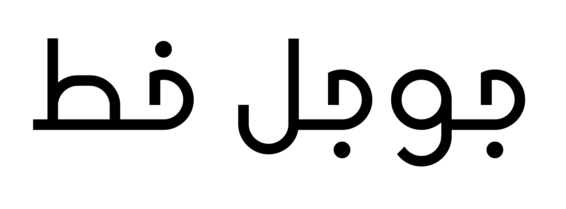
I couldn’t find a modern Arabic typeface that matched the Google logo I designed. So, I made a fully functioning Arabic typeface that matches both Product Sans (the Latin typeface Google uses) and the Google aesthetic.
In the traditional way of writing Arabic, the letterforms are based on calligraphy. You can see brush marks in mostly every letter and the curves are drawn in a unique way. However, when we handwrite Arabic, we have to simplify the letters in order to write fast. Here’s an example of the same letter (ha’) written in both ways;
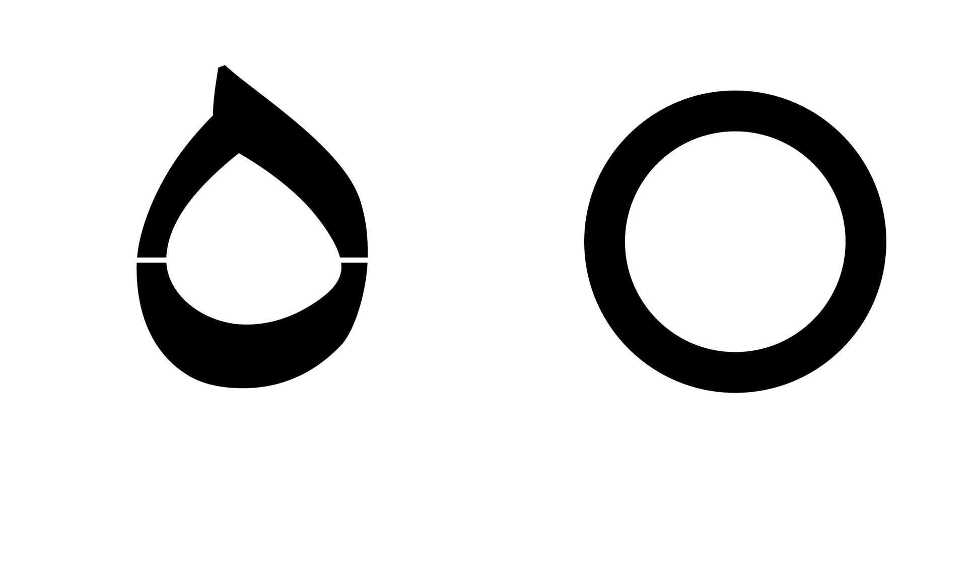
You can see that in the traditional way of writing the letter, there’s an accent on the bottom of the curve. The simplified way of writing it is to just draw a circle. I compare this transition to the one between a blackletter typeface to a sans serif one.
Because I wanted my typeface to look modern and simplified, I based my letterforms on the handwritten Arabic.
In addition, my typeface needed to be based on the Google aesthetic. After analyzing the various designs made by Google, I realized that the four main elements they use are;
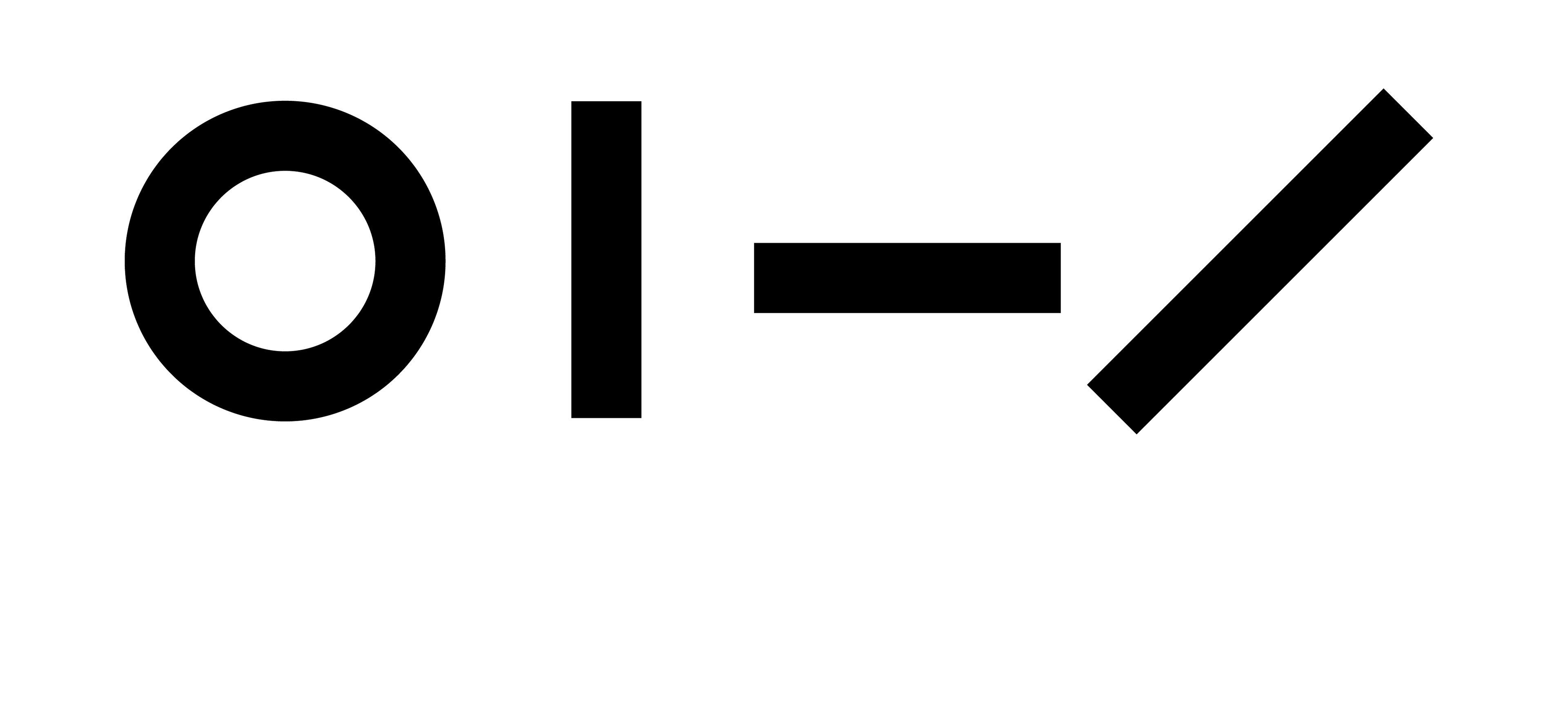
All of my letters were constructed using these elements in order to match the Google Aesthetic and Products Sans (the Latin character typeface used by Google).
Title
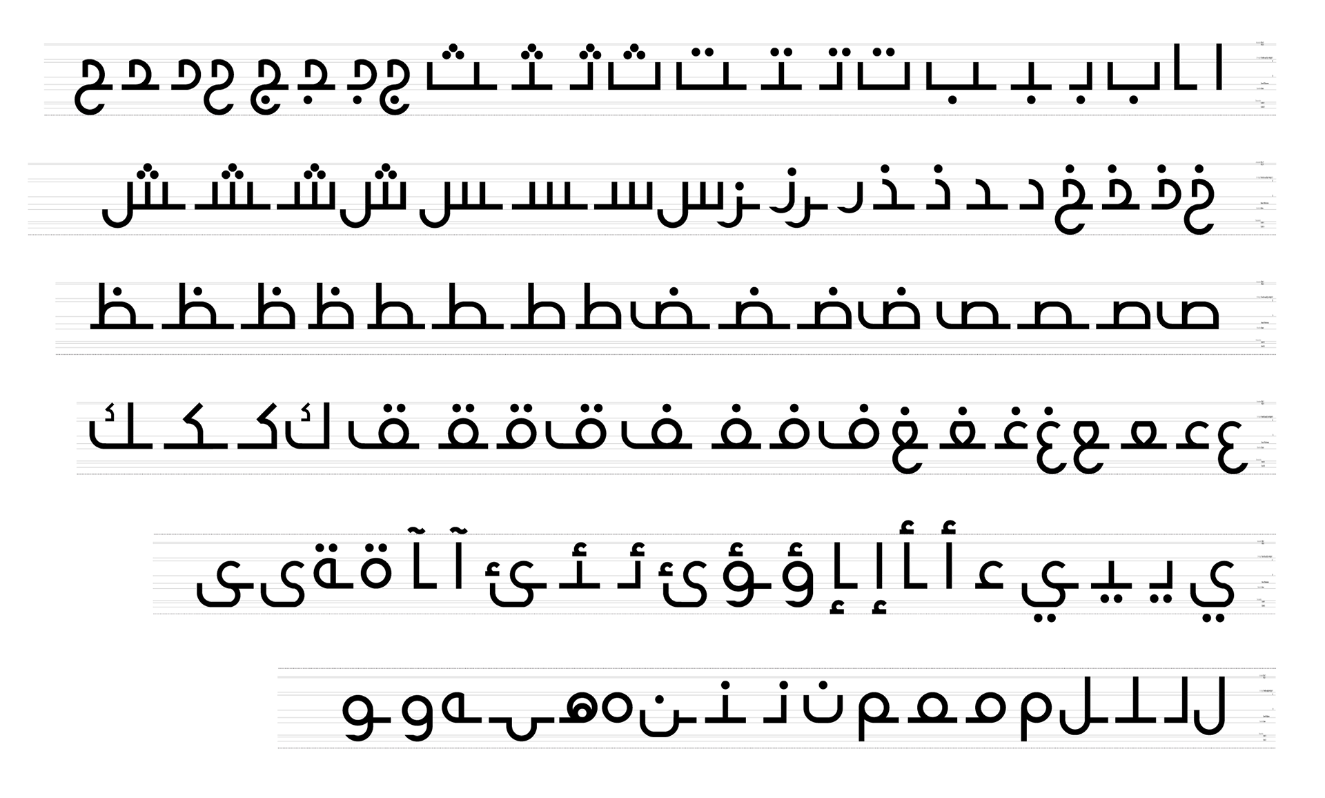
Characters

Pangram
After making the typeface, it became easier for me to create more content for the prototype. So, the next part of Google that needed to be redesigned were the webpages.