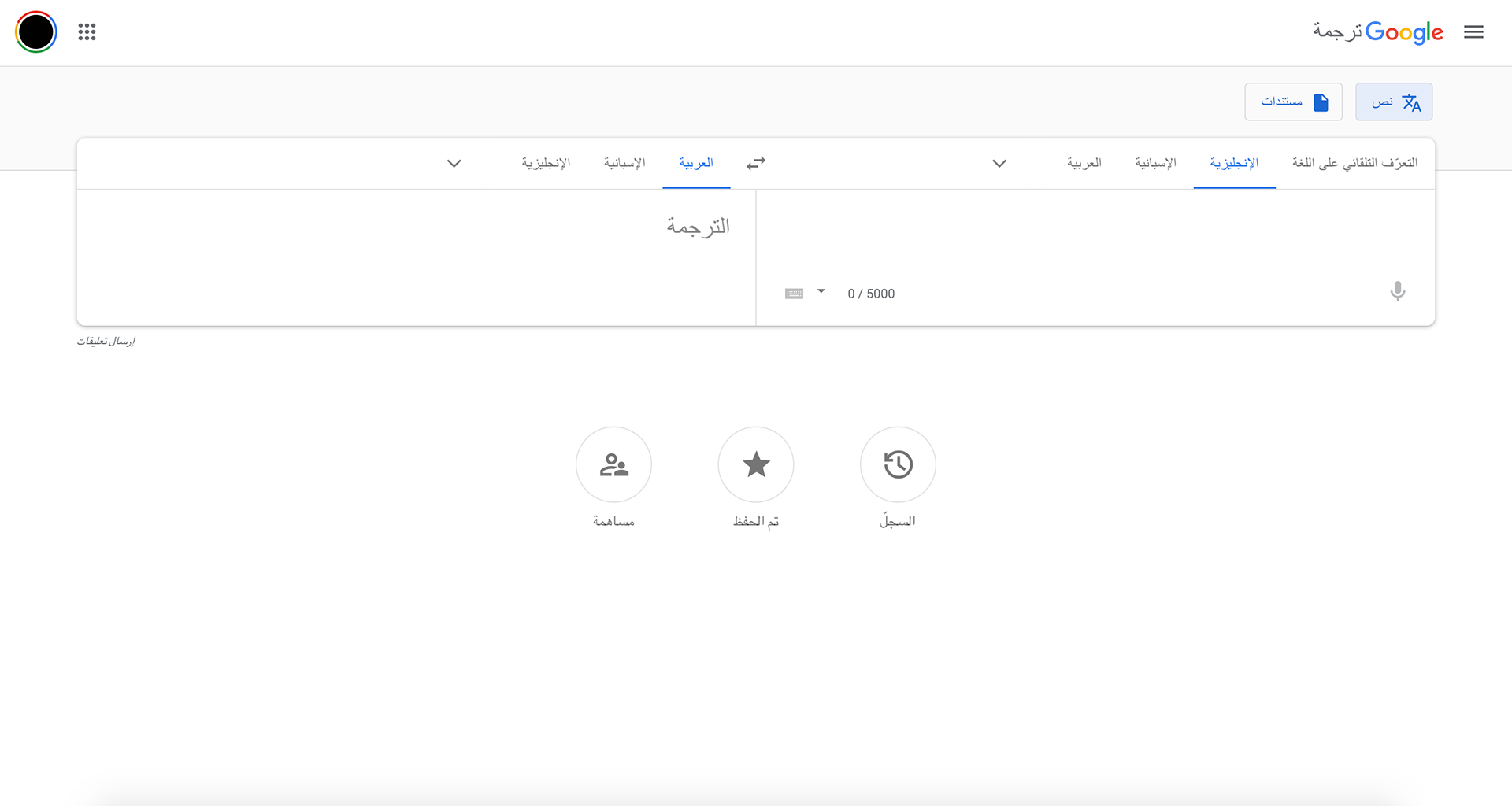
I had already analyzed the existing Arabic version of Google Search which had many flaws. The main focus for me was to make my design easier to read and look more modern. I made sure to have most of the information written in Arabic in order for the eye movement to be mainly from right to left. I also worked on hierarchy: I wanted the main information to be seen first and for that everything needed to be in coordination with one another. And finally, my last focus was the typeface. I used the typeface I designed so that it looks good with both the Arabic Google logo and the Google aesthetic. And since everything Google does is modern, this Arabic modern typeface worked well with their compositions.
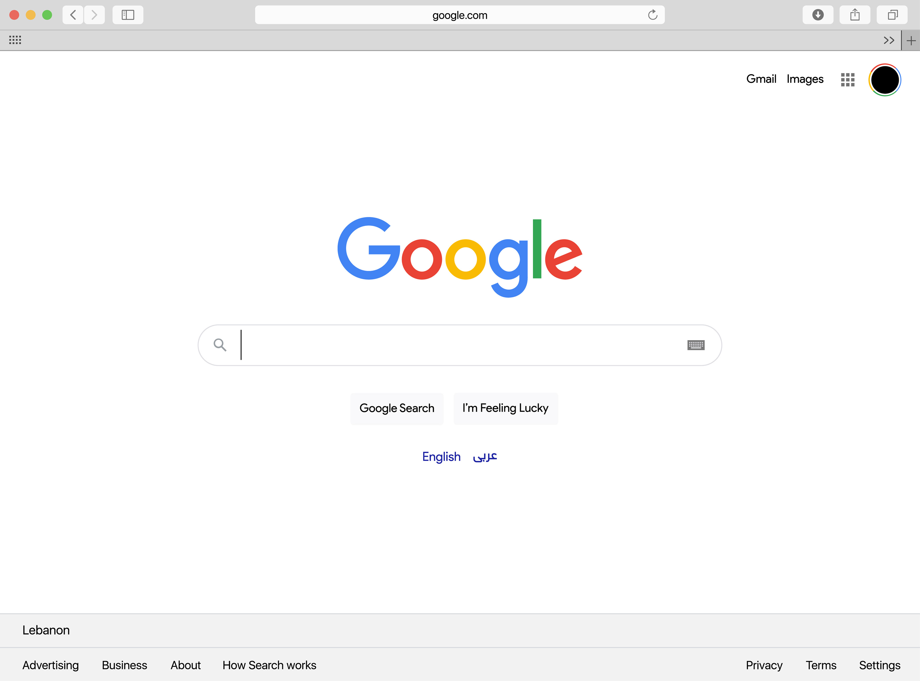
English Version
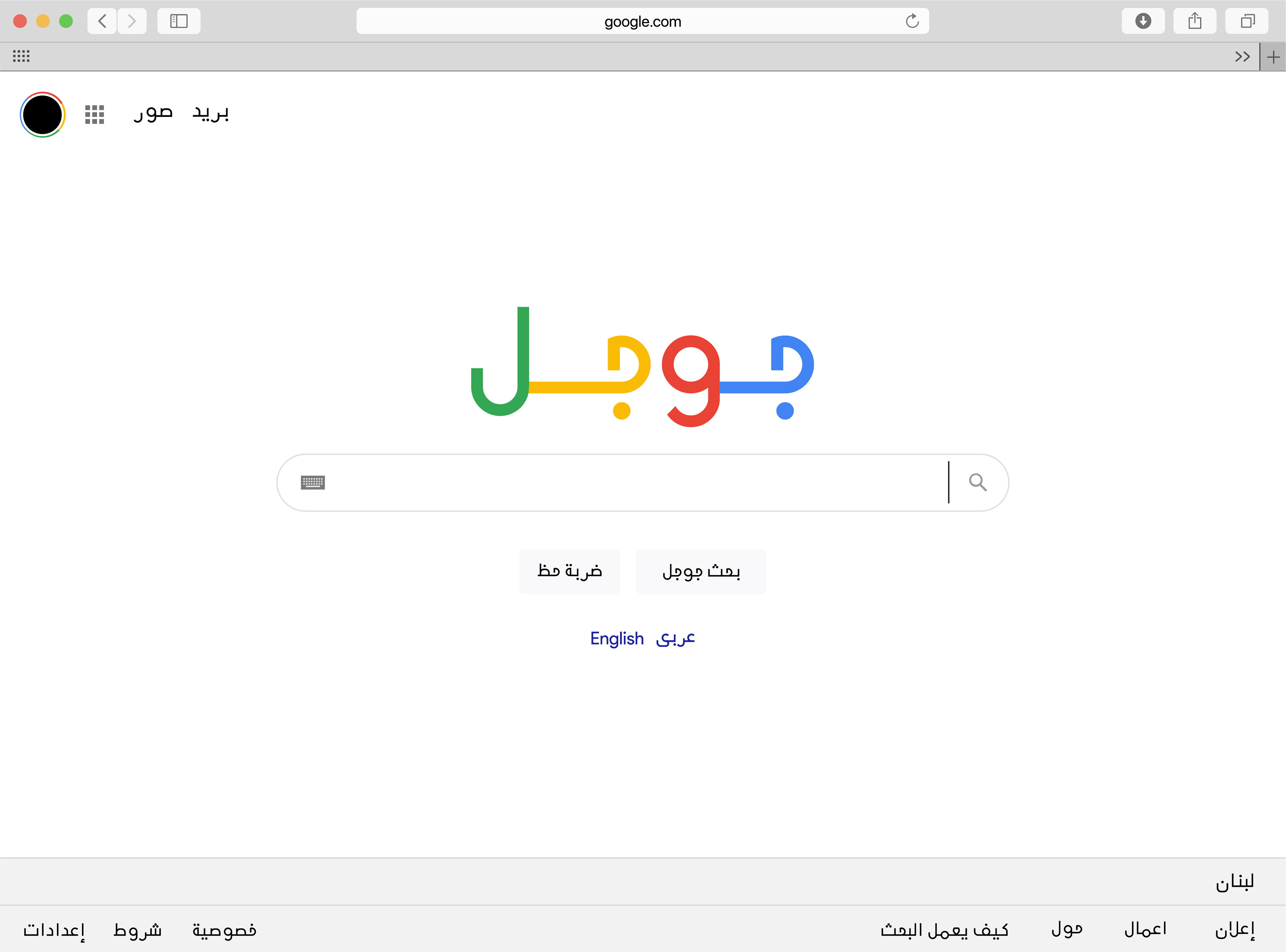
Updated Arabic Version
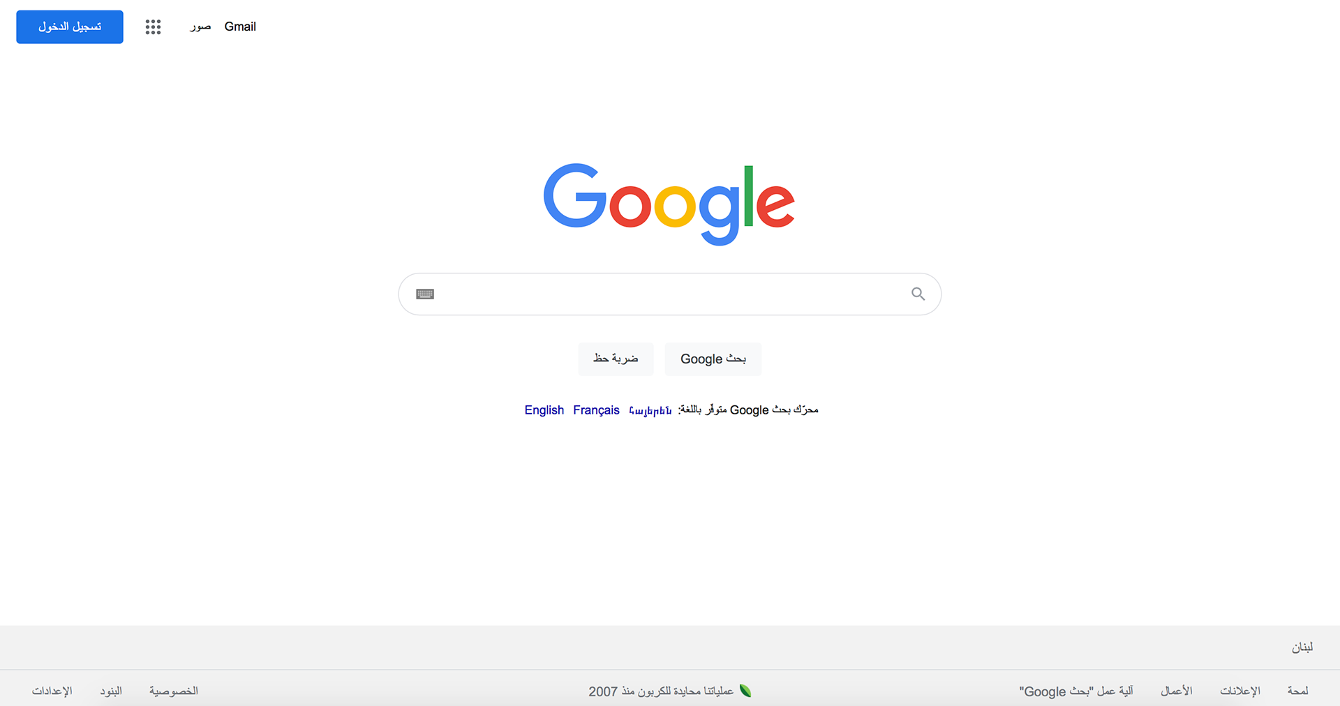
Original Arabic Version
The Google Search Result was a little trickier. On one hand, some of the information needed to stay in English. So, I worked on keeping the hierarchy and eye movement the same although they were some conflicts. And on the other hand, there was way more text than the other webpage. With the traditional Arabic typeface, body of texts on a screen may look too dense and not pleasing for the eye. But with the new typeface I designed, I simplified a lot of the unnecessary elements of the letterforms and made everything geometrical. Although it looks denser than the English version, it’s still easy to read.
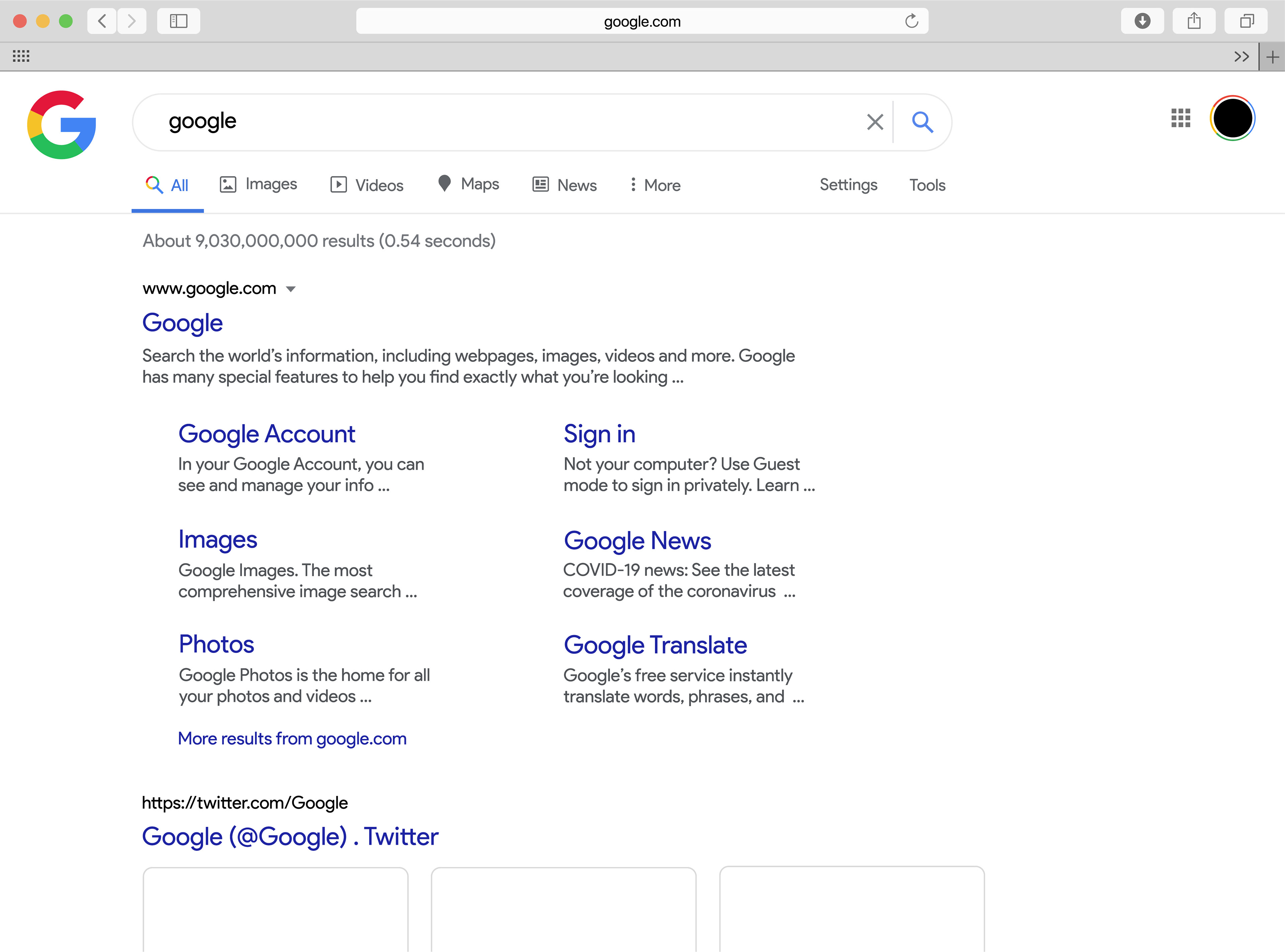
English Version
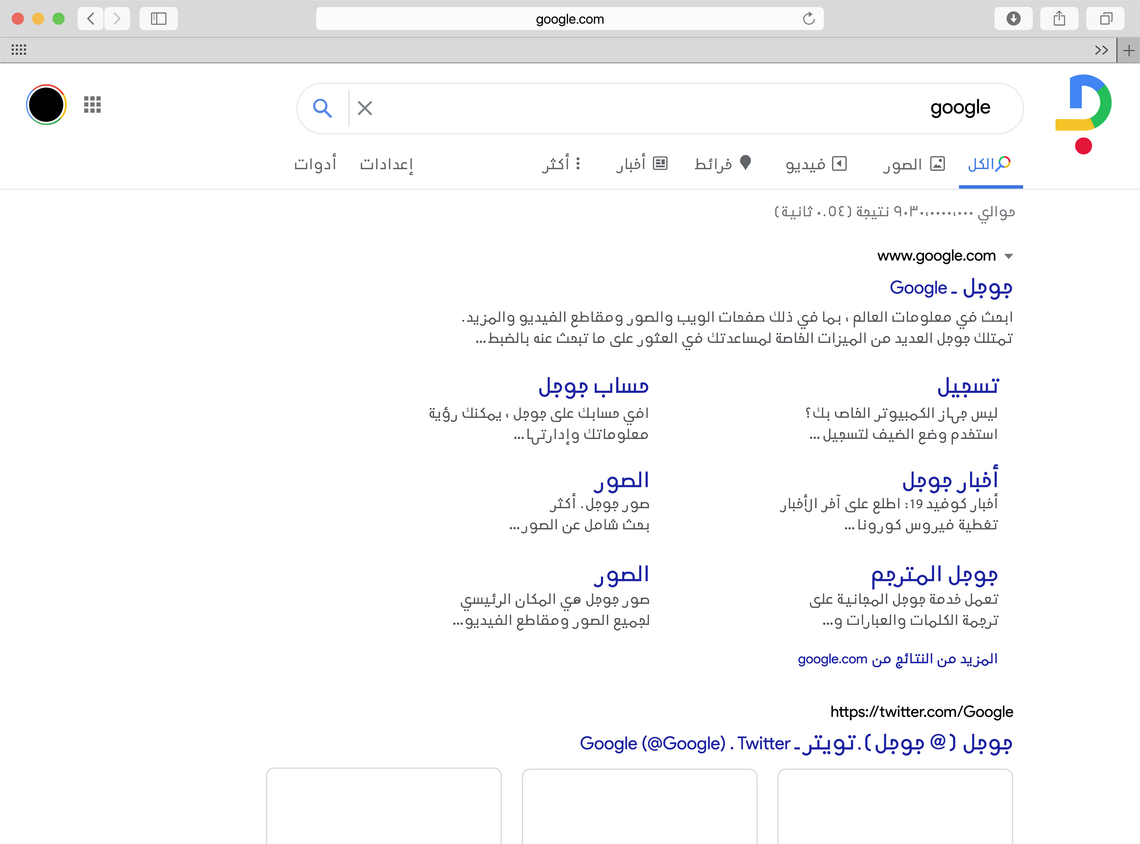
Updated Arabic Version
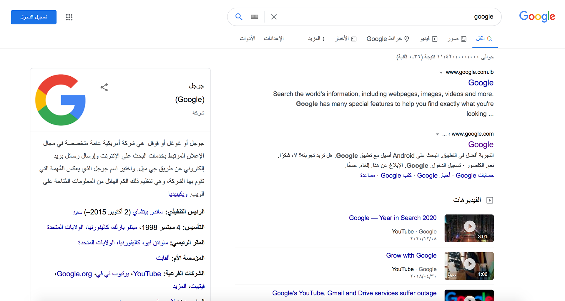
Original Arabic Version
The challenge with the Google Chrome webpage were the services on the bottom. Some of the logos were based on Latin characters. So, I redesigned them using Arabic letters while keeping them in the same style. The rest of the webpage looks similar to the Google Search one.
PS, there is no Arabic version of Google Chrome, so I designed one myself.
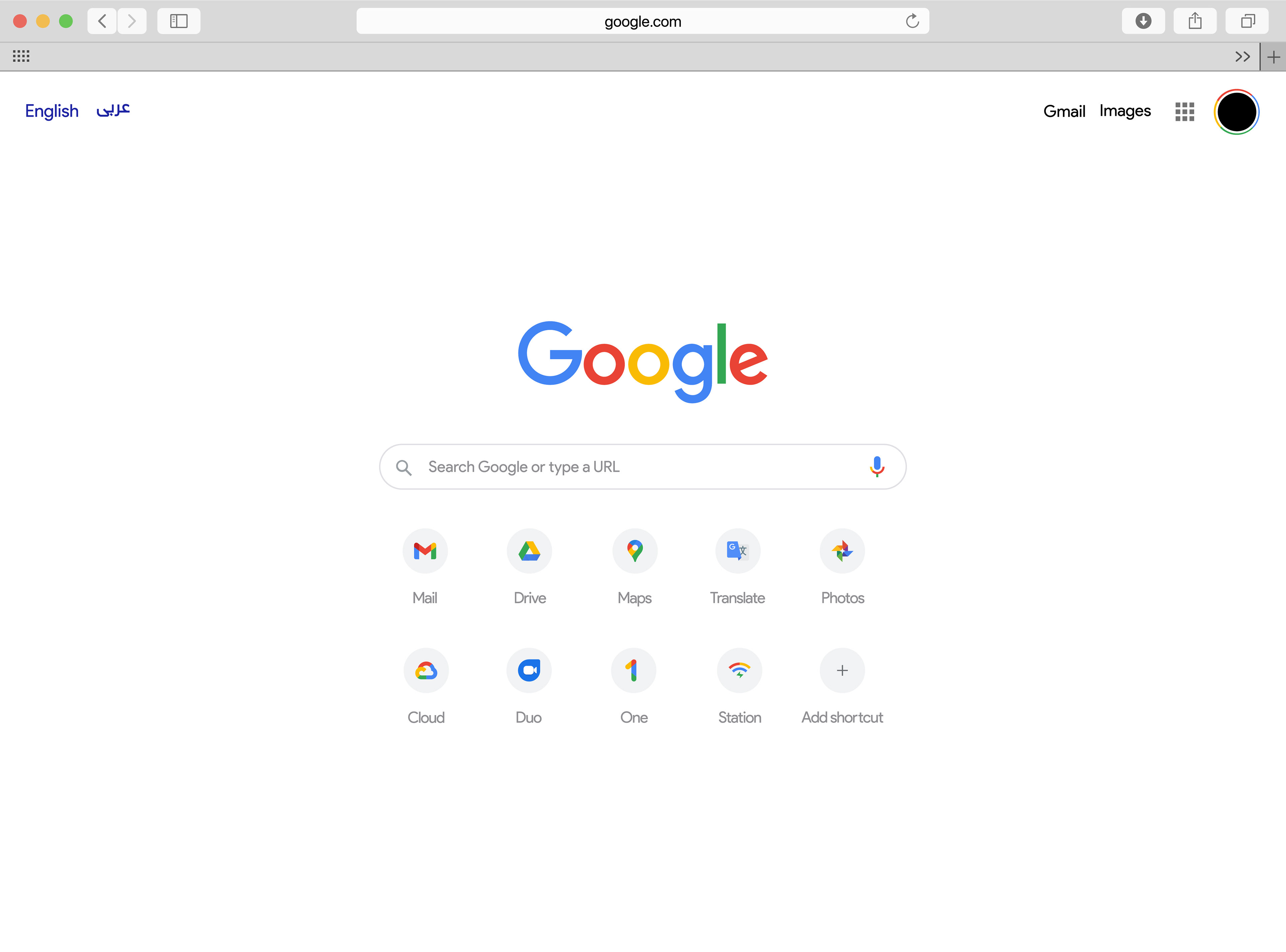
English Version
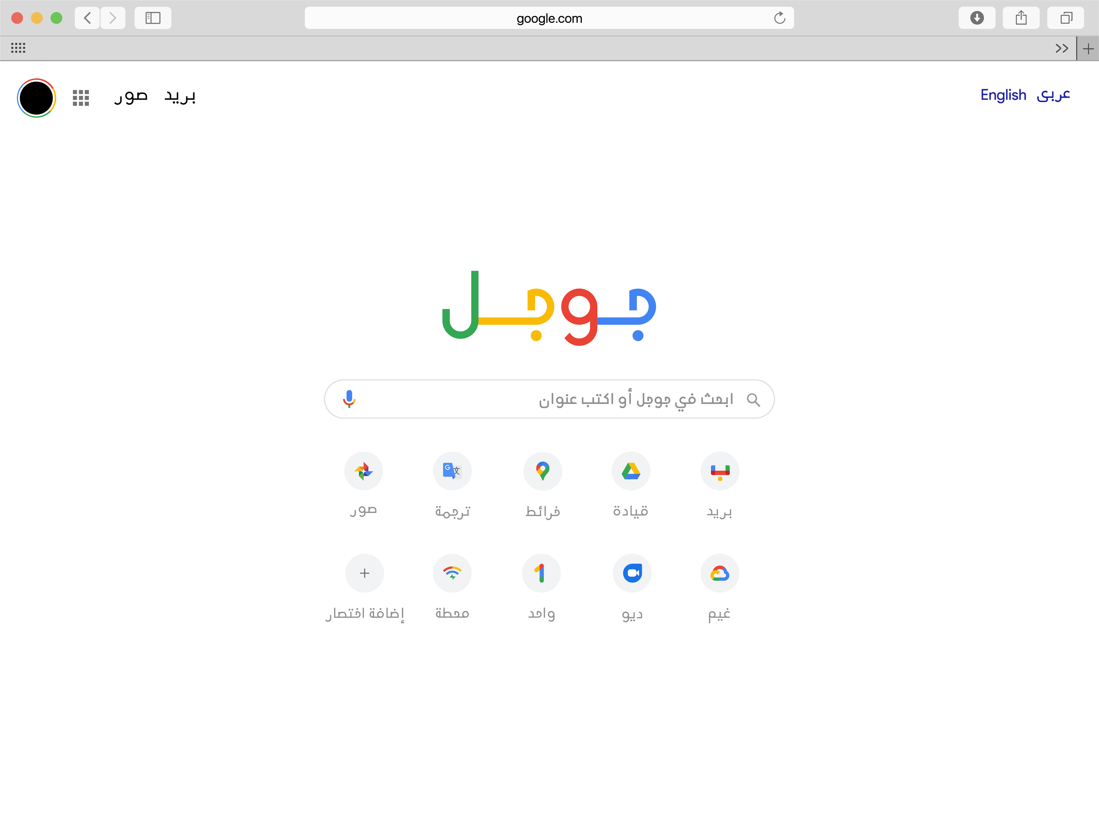
Arabic Version
For the Google Translate webpage, the issue I’ve always noticed is the lack of accessibility. If people don’t really know how to read English and are using the service in order to understand it, they need to be able to switch it to their language easily.
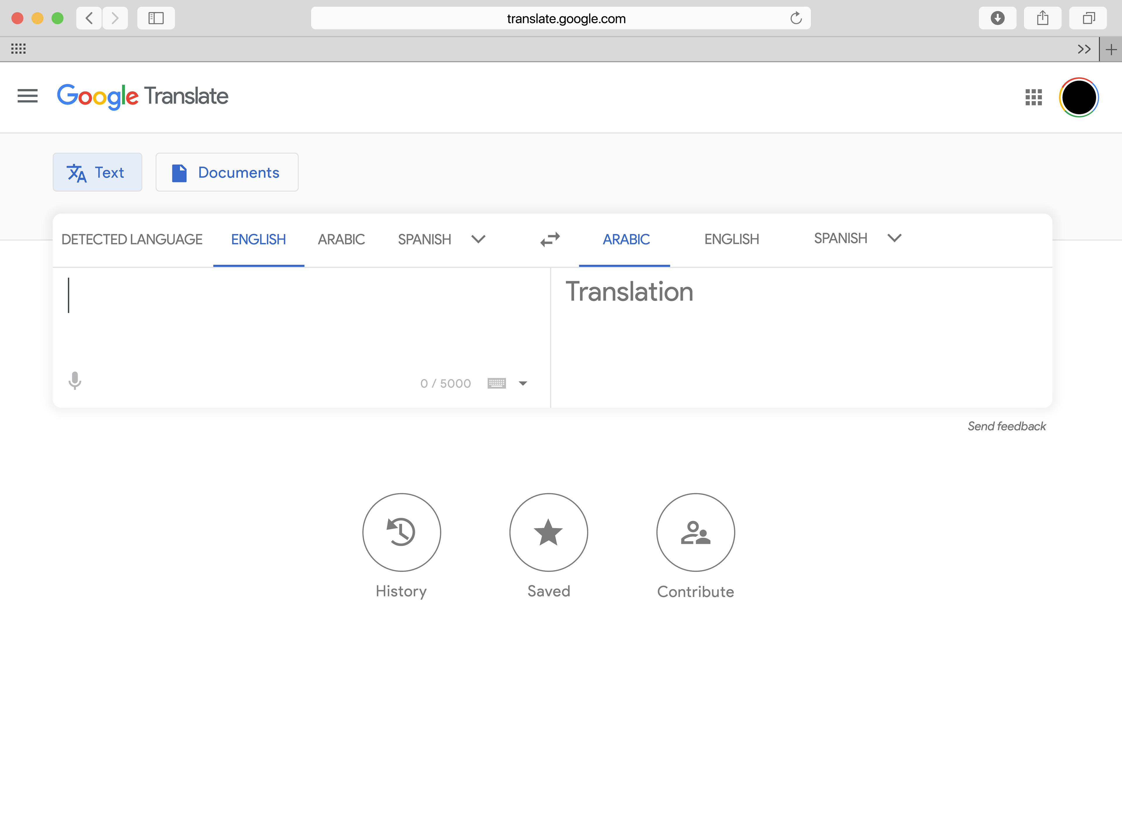
English Version
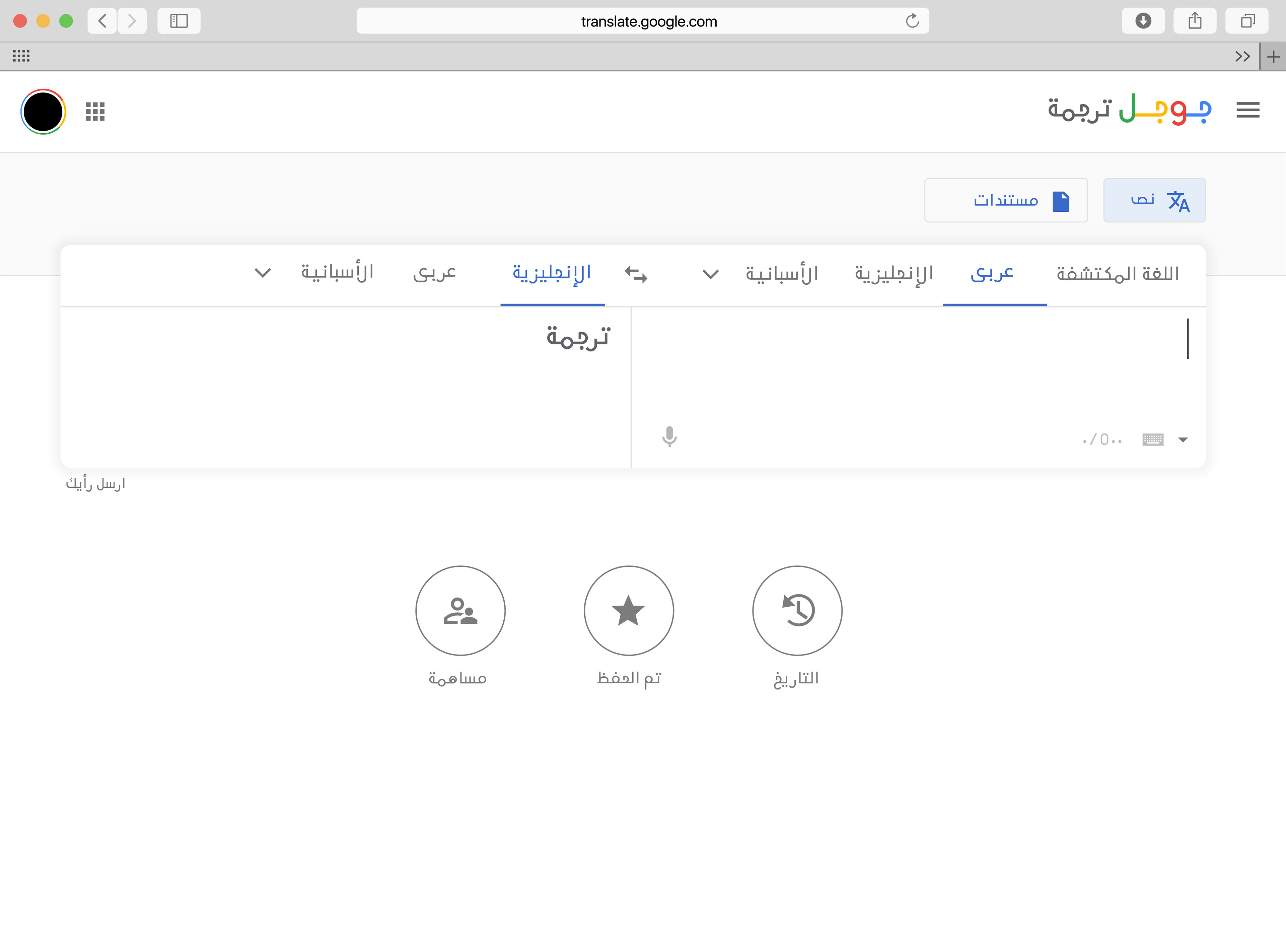
Updated Arabic Version
